
Desktop
Buy Now Pay later
Buy Now Pay later
While ancillary insurance products provide peace of mind, many PenFed customers faced a major obstacle: high upfront costs ranging from $500 to $3,000. This led to high drop-off rates, frustrated customers, and increased service calls. Many users abandoned applications due to unclear financing options and limited payment flexibility.
To address this, I led a cross-functional team to design and implement a Buy Now, Pay Later (BNPL) financing optionfor PenFed’s auto protection plans. By enabling customers to split payments into manageable installments, we removed a critical barrier, improving accessibility, reducing drop-offs, and increasing adoption—creating a seamless, user-centric financing experience aligned with PenFed’s strategic goals.
10% Abandonment Rate
55% Adoption Rate
40% Completion Rate
100% Accessibility Compliance


My Role
As the lead designer—and only designer on the Auto team—I spearheaded this project from initial research through final implementation. Using Figma, Jira, Confluence, Photoshop, Google Analytics, and heatmaps, I crafted a seamless experience that integrated the BNPL feature into PenFed's auto protection plans. My role involved turning complex business requirements into user-centric designs, testing concepts, and refining based on feedback to deliver a polished product.
The Challenge
The insurance product was owned by our vendor, which presented several hurdles: limited flexibility in redesigning vendor-controlled elements, a mandatory 10% down payment requirement that could deter users, and a lack of clarity in the existing process.
Additionally, I needed to address significant drop-off rates at critical points in the journey, including a 12% drop-off at the "Plan Eligibility Screen" and 18% abandonment at the "Payment Confirmation Page." The key was to reduce friction, simplify communication, and create an intuitive process that aligned with both user needs and business goals.
This was our top priority, with only 2 sprints (1 month) allocated to solve it. Despite these time constraints, I collaborated with the product team, engineering team, and our third-party vendor to transform a complicated and rigid user flow into a seamless and user-friendly experience.
CHAPTER 1
Envision
This phase focused on diving into the problem space to understand user frustrations and pain points, validate problem statements, and conduct research to uncover opportunities for improvement.
My goal was to define clear strategies and actionable insights by analyzing user pain points and the existing user flow for the add on warranty products.
User Behavior Analysis
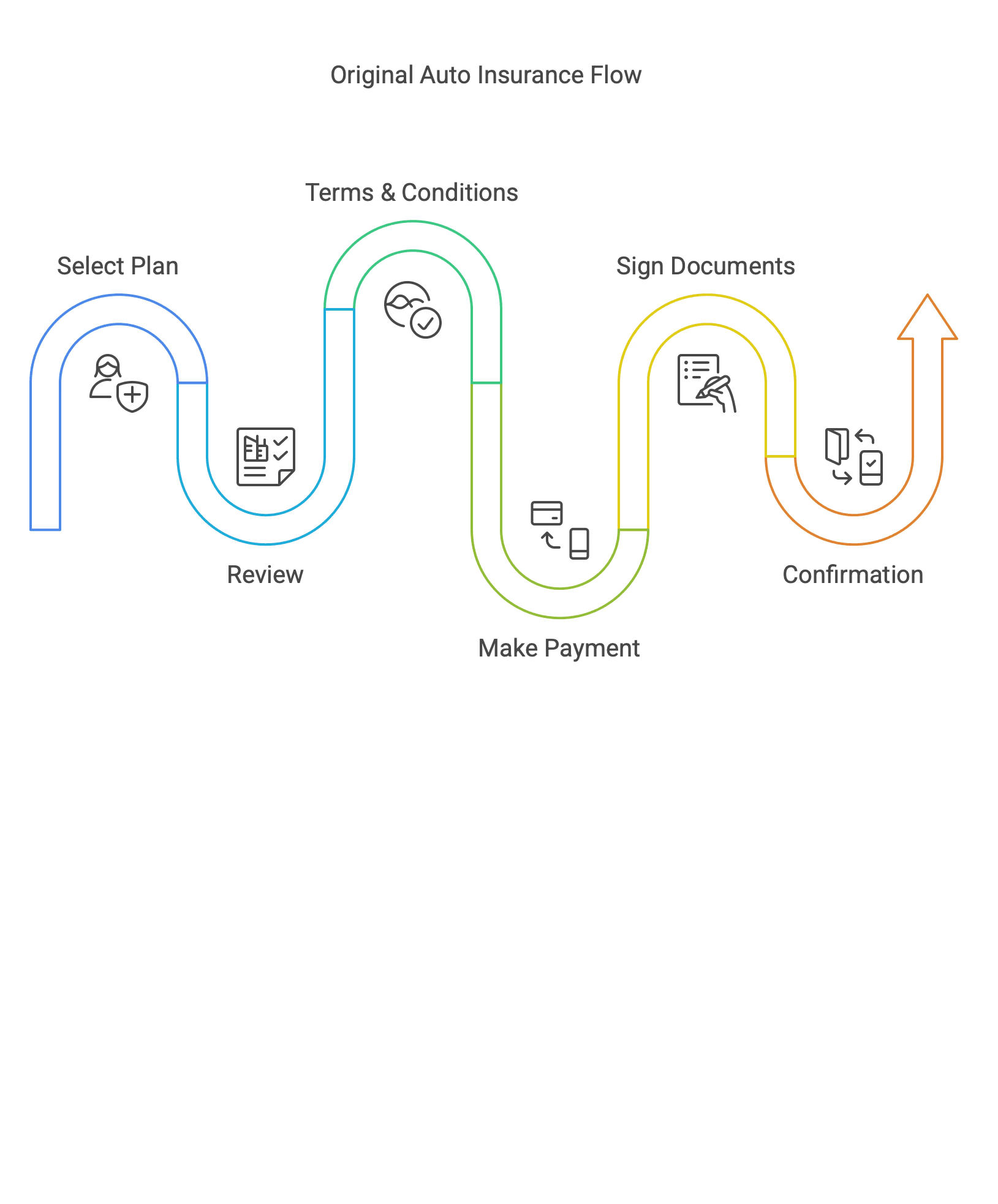
First, I created and analyzed the existing user flow for the insurance product: Vehicle eligibility > Select a plan > Review coverage > Review Terms and conditions > Payment option (credit card or ACH in full) > Confirmation page
First, I created and analyzed the existing user flow for the insurance product: Vehicle eligibility > Select a plan > Review coverage > Review Terms and conditions > Payment option (credit card or ACH in full) > Confirmation page

Validate Data
Next, I reviewed Google Analytics data and collaborated with stakeholders to identify user drop-off points, particularly on the "Plan Eligibility" and "Payment Confirmation" screens. Heatmaps provided additional insight into user behavior, confirming where interactions faltered. This comprehensive analysis validated the need to streamline the flow and address user confusion at critical decision points.
Next, I reviewed Google Analytics data and collaborated with stakeholders to identify user drop-off points, particularly on the "Plan Eligibility" and "Payment Confirmation" screens. Heatmaps provided additional insight into user behavior, confirming where interactions faltered. This comprehensive analysis validated the need to streamline the flow and address user confusion at critical decision points.

Key Findings So Far
The optimized user journey is projected to significantly decrease abandonment rates at critical steps such as checkout, product selection, etc.
The optimized user journey is projected to significantly decrease abandonment rates at critical steps such as checkout, product selection, etc.
Eligibility page
Eligibility page
VIN, Mileage, Zip-code, and State of vehicle registration are required, but there is no explanation of why this information is needed
VIN, Mileage, Zip-code, and State of vehicle registration are required, but there is no explanation of why this information is needed
Plan Selection Page
Plan Selection Page
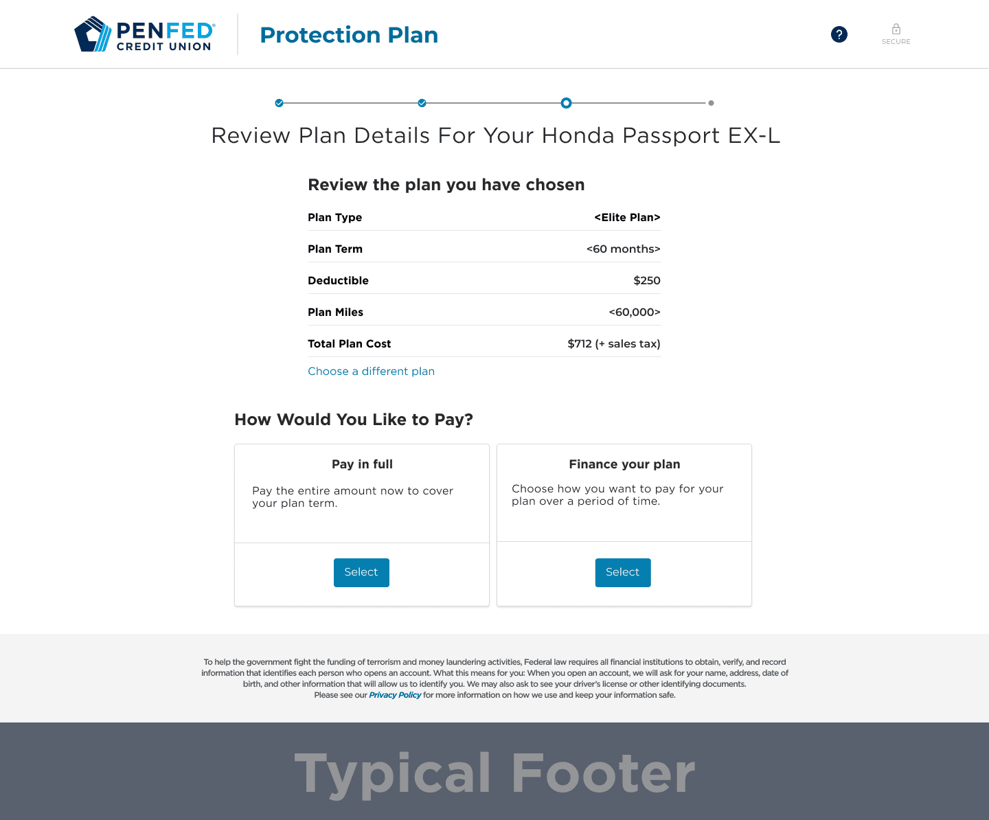
We have 3 levels of plans—Elite plan, Enhanced plan, and Essential plan—each with 12 deductible options to choose from. This information overload is overwhelming, making decisions difficult, and the interface doesn't help users make quick decisions about the product they're selecting.
We have 3 levels of plans—Elite plan, Enhanced plan, and Essential plan—each with 12 deductible options to choose from. This information overload is overwhelming, making decisions difficult, and the interface doesn't help users make quick decisions about the product they're selecting.
Review & Pay Page
Review & Pay Page
After plan selection, users are directed to the Review and Pay page with only one payment option paying in full and no alternative payment choice
After plan selection, users are directed to the Review and Pay page with only one payment option paying in full and no alternative payment choice
Hear our clients' voices
To complement the data, I conducted interviews with call center managers and analyzed clients complaint calls. Here are some representative quotes from them
To complement the data, I conducted interviews with call center managers and analyzed clients complaint calls. Here are some representative quotes from them

"The process is confusing—there are too many options to choose from and no easy way to compare them. It stresses me out because I don't want to make the wrong decision."

"Honestly, I know it's an insurance product, but there are too many options and it's hard to decide which one to choose."

"I pay my other insurance products monthly. This protection plan would be nice to have, but paying the full amount upfront is too expensive, especially for an optional product."
"The process is confusing—there are too many options to choose from and no easy way to compare them. It stresses me out because I don't want to make the wrong decision."
"Honestly, I know it's an insurance product, but there are too many options and it's hard to decide which one to choose."
"I pay my other insurance products monthly. This protection plan would be nice to have, but paying the full amount upfront is too expensive, especially for an optional product."
Empathy Mapping
Synthesizing all findings, I found that users thought about balancing costs while feeling anxious about making mistakes. These insights inspired me to focus on reducing cognitive load and highlighting financing benefits, forming the foundation for my design strategy.
Think: Users calculate costs and worry about long-term value.
Feel: Anxiety about making large payments and confusion over unclear processes.
Say: Desire for flexible options and frustration with complex enrollment.
Hear: Influences from competitors' offerings and peers' experiences.
Pains: Upfront costs and lack of transparency.
Gains: Flexible financing options and user-friendly processes.

Competitive Analysis
After validating user pain points, I analyzed competitors like Progressive, Affirm, and AfterPay. Their best practices—including transparent payment breakdowns and simple flows—shaped my vision for PenFed's BNPL integration. Our analysis revealed we needed to focus on payment flexibility for purchases between $500 and $3,000, a key range for our users.
After validating user pain points, I analyzed competitors like Progressive, Affirm, and AfterPay. Their best practices—including transparent payment breakdowns and simple flows—shaped my vision for PenFed's BNPL integration. Our analysis revealed we needed to focus on payment flexibility for purchases between $500 and $3,000, a key range for our users.
Note: I chose these platforms because many direct competitors like Navy Federal required taking out a loan to view their payment flow. Instead, I leveraged Progressive, where I have my auto loan, to gain insights into their user flow. I also analyzed leading BNPL platforms that offer installment payments. This led me to focus on Afterpay and Affirm as they are the
Note: I chose these platforms because many direct competitors like Navy Federal required taking out a loan to view their payment flow. Instead, I leveraged Progressive, where I have my auto loan, to gain insights into their user flow. I also analyzed leading BNPL platforms that offer installment payments. This led me to focus on Afterpay and Affirm as they are the

CHAPTER 2
CREATE
At this phase, I converted insights into remedies by enhancing the phrasing of the content to align with PenFed's brand, rearranged the plan selection page to highlight the price differences among the plans, and introduced flexible payment options. Given the product costs varying from $500 to $3,000, we treasured payment flexibility to cater to a variety of financial means. Before we kick start, let's explore the initial user flow compared to the revised user flow.
At this phase, I converted insights into remedies by enhancing the phrasing of the content to align with PenFed's brand, rearranged the plan selection page to highlight the price differences among the plans, and introduced flexible payment options. Given the product costs varying from $500 to $3,000, we treasured payment flexibility to cater to a variety of financial means. Before we kick start, let's explore the initial user flow compared to the revised user flow.
Client Path: Original vs Revamped
Client Path: Original vs Revamped
The original user flow was rigid and unintuitive, requiring users to review terms and sign before even seeing their payment options. This created friction and hesitation, leading to higher drop-off rates. Users lacked clarity on their choices, especially when it came to financing. The revamped flow prioritizes transparency and decision-making by presenting payment options earlier in the process. This allows users to understand their payment choices upfront, reducing confusion and improving completion rates. The flow was also optimized for efficiency, cutting unnecessary steps for those paying in full while keeping financing users engaged with a streamlined experience.
The original user flow was rigid and unintuitive, requiring users to review terms and sign before even seeing their payment options. This created friction and hesitation, leading to higher drop-off rates. Users lacked clarity on their choices, especially when it came to financing. The revamped flow prioritizes transparency and decision-making by presenting payment options earlier in the process. This allows users to understand their payment choices upfront, reducing confusion and improving completion rates. The flow was also optimized for efficiency, cutting unnecessary steps for those paying in full while keeping financing users engaged with a streamlined experience.
Note: If you choose "Pay in Full," consolidate to 5 steps from 6 steps in original flow
Note: If you choose "Pay in Full," consolidate to 5 steps from 6 steps in original flow

Revamp Pages: Design Limitation
One of the biggest challenges was design limitations, as certain pages were controlled by the vendor. This restricted how much we could modify, requiring us to work within constraints while still improving the user experience. Some design recommendations were placed in the backlog for future sprints, as they required organization-wide changes or impacted multiple business lines.
One of the biggest challenges was design limitations, as certain pages were controlled by the vendor. This restricted how much we could modify, requiring us to work within constraints while still improving the user experience. Some design recommendations were placed in the backlog for future sprints, as they required organization-wide changes or impacted multiple business lines.
Plan Selection Page
Limitation: Impacts multiple business lines, requiring organization-wide approval.
Solution: Restructured content to improve clarity while maintaining compliance
Impact: Ensures consistency across business units without disrupting operations
Note: If you choose "Pay in Full," you'll skip the Financing Option Page and go directly to "Review and Pay."
Before
After

Plan Selection Page
To promote transparency early in the process, I clearly presented payment options on the Plan selection page, allowing users to choose between paying in full immediately or selecting an installment plan for up to 36 months. Users can choose between "Pay in Full" or "Financing" (Buy Now, Pay Later option).Users can easily return to the previous screen to adjust their plan selection.Selected plans can be reviewed and modified at this step.
Note: If you choose "Pay in Full," you'll skip the Financing Option Page and go directly to "Review and Pay."
Before
After
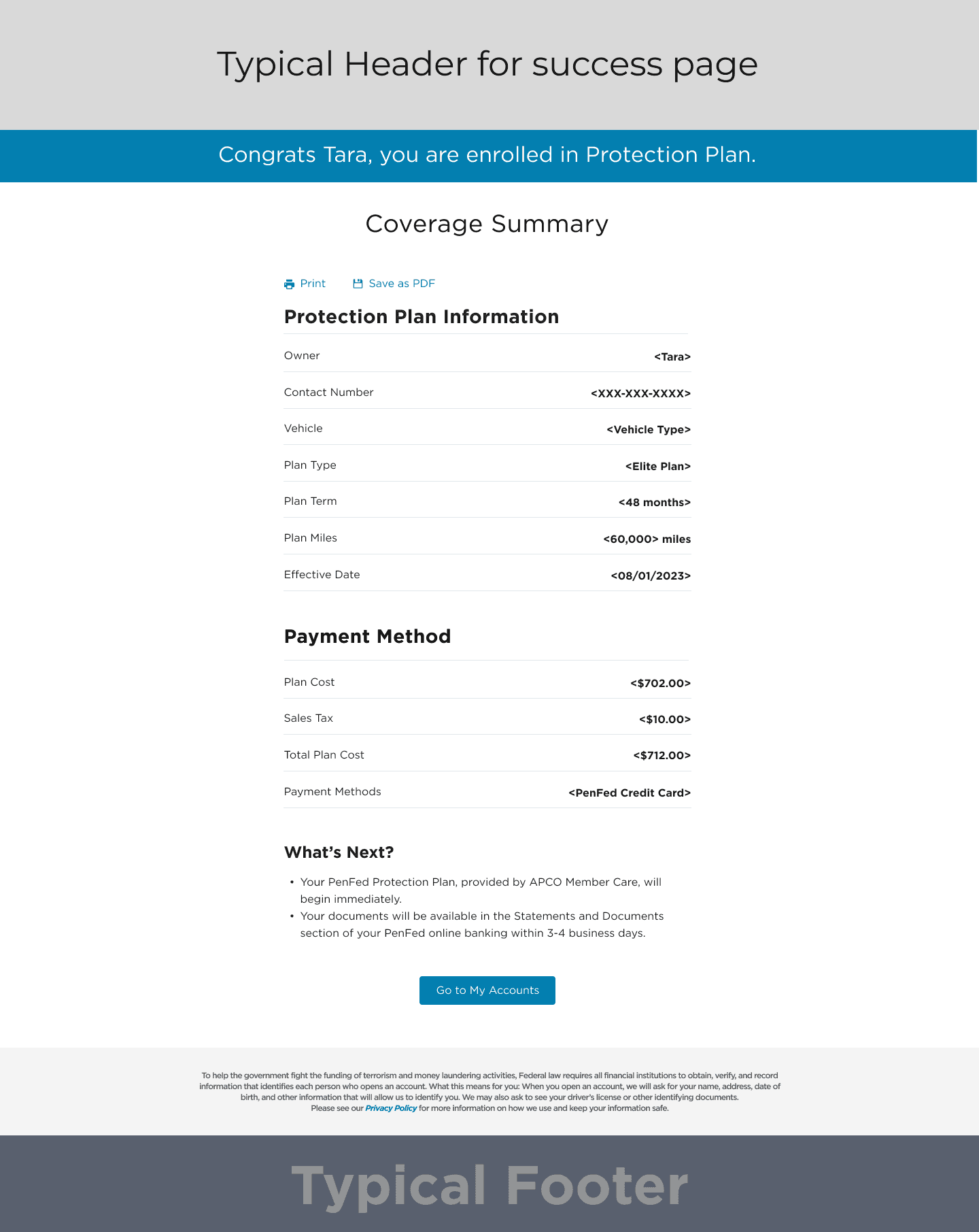
Confirmation Page
Limitation: Impacts multiple business lines, requiring organization-wide approval.
Solution: Restructured content to improve clarity while maintaining compliance
Impact: Ensures consistency across business units without disrupting operations
Note: If you choose "Pay in Full," you'll skip the Financing Option Page and go directly to "Review and Pay."
Before
After
Confirmation Page
Limitations: Impacts multiple business lines, requiring organization-wide approval.- Solution: Restructured content to improve clarity while maintaining compliance.- Impact: Ensures consistency across business units without disrupting operations.
Note: If you choose "Pay in Full," you'll skip the Financing Option Page and go directly to "Review and Pay."
Before
After
New Pages
New Pages
Payment Option,Financing, and Review Page
Payment Option
To promote transparency early in the process, I clearly presented payment options on the Plan selection page, allowing users to choose between paying in full immediately or selecting an installment plan for up to 36 months. Users can choose between "Pay in Full" or "Financing" (Buy Now, Pay Later option).Users can easily return to the previous screen to adjust their plan selection.Selected plans can be reviewed and modified at this step.
Note: If you choose "Pay in Full," you'll skip the Financing Option Page and go directly to "Review and Pay."
Payment Option
Financing Option
Review Page

Payment Option
To promote transparency early in the process, I clearly presented payment options on the Plan selection page, allowing users to choose between paying in full immediately or selecting an installment plan for up to 36 months. Users can choose between "Pay in Full" or "Financing" (Buy Now, Pay Later option).Users can easily return to the previous screen to adjust their plan selection.Selected plans can be reviewed and modified at this step.
Note: If you choose "Pay in Full," you'll skip the Financing Option Page and go directly to "Review and Pay."
Payment Option
Financing Option
Review Page
Payment Option
To promote transparency early in the process, I clearly presented payment options on the Plan selection page, allowing users to choose between paying in full immediately or selecting an installment plan for up to 36 months. Users can choose between "Pay in Full" or "Financing" (Buy Now, Pay Later option).Users can easily return to the previous screen to adjust their plan selection.Selected plans can be reviewed and modified at this step.
Note: If you choose "Pay in Full," you'll skip the Financing Option Page and go directly to "Review and Pay."
Payment Option
Financing Option
Review Page
Enhancing Content, Accessibility, and Performance
Redesigning the user flow and introducing new pages was only part of the solution. To ensure a seamless, high-performing experience, I focused on refining key aspects of the content, accessibility, code implementation, and quality assurance.
Dynamic Content
I worked with Stephanie, our content strategist, to develop dynamic content that adapted to user profiles and purchase stages. We tested it with personas to ensure clarity, relevance, and alignment with PenFed’s voice.
Dynamic Content
I worked with Stephanie, our content strategist, to develop dynamic content that adapted to user profiles and purchase stages. We tested it with personas to ensure clarity, relevance, and alignment with PenFed’s voice.
Accessibility
With 70% of users over 45, accessibility was key. I collaborated with AJ, our Developer Lead, to ensure WCAG compliance, optimizing layouts for screen readers and responsive design across all devices.
Accessibility
With 70% of users over 45, accessibility was key. I collaborated with AJ, our Developer Lead, to ensure WCAG compliance, optimizing layouts for screen readers and responsive design across all devices.
Code Development
Working with AJ, I ensured clean, scalable code aligned with design integrity. Due to Salesforce constraints, we leveraged existing components to maintain UX consistency while implementing high-impact design solutions.
Code Development
Working with AJ, I ensured clean, scalable code aligned with design integrity. Due to Salesforce constraints, we leveraged existing components to maintain UX consistency while implementing high-impact design solutions.
QA Testing
I collaborated with AJ to test responsiveness using BrowserStack, ensuring compatibility across devices. Prioritizing fixes based on user distribution, we optimized performance for Chrome (73%), Safari (12%), and Firefox (9%).
QA Testing
I collaborated with AJ to test responsiveness using BrowserStack, ensuring compatibility across devices. Prioritizing fixes based on user distribution, we optimized performance for Chrome (73%), Safari (12%), and Firefox (9%).
CHAPTER 3
OPTIMIZE
This phase was all about refining and improving. I monitored performance metrics, gathered feedback, and iterated on the design to ensure continuous alignment with user needs and business success. One significant challenge was the vendor’s restrictions on redesigning the product selection page. These limitations meant that only certain screens could be updated, leaving others unchanged. I documented these constraints and decisions to monitor their impact post-release, ensuring future iterations address any uncovered issues.
This phase was all about refining and improving. I monitored performance metrics, gathered feedback, and iterated on the design to ensure continuous alignment with user needs and business success. One significant challenge was the vendor’s restrictions on redesigning the product selection page. These limitations meant that only certain screens could be updated, leaving others unchanged. I documented these constraints and decisions to monitor their impact post-release, ensuring future iterations address any uncovered issues.
Behavioral Changes in User Journey Chart
Behavioral Changes in User Journey Chart
Since post-launch monitoring results are not yet available, I defined preliminary success indicators based on user engagement, adoption, and usability improvements. This chart visually represents how BNPL is expected to influence and improve user behavior throughout their purchasing journey.
Since post-launch monitoring results are not yet available, I defined preliminary success indicators based on user engagement, adoption, and usability improvements. This chart visually represents how BNPL is expected to influence and improve user behavior throughout their purchasing journey.
Key Finding: Users are anticipated to progress through the journey more efficiently, increasing overall conversion rates.
Key Finding: Users are anticipated to progress through the journey more efficiently, increasing overall conversion rates.

Adoption Rate Chart
This chart showcases the anticipated increase in BNPL adoption post-implementation, reinforcing our success metric of boosting financing selections.
This chart showcases the anticipated increase in BNPL adoption post-implementation, reinforcing our success metric of boosting financing selections.
Key Finding: BNPL adoption is expected to increase significantly, demonstrating improved user acceptance of financing options.
Key Finding: BNPL adoption is expected to increase significantly, demonstrating improved user acceptance of financing options.

Heat-map of Drop-Off Rates
Heat-map of Drop-Off Rates
The heatmap provides a comparative analysis of pre- and post-implementation user drop-off rates. We've seen drop-off rates improve in a short time period, showing the success of this initiative's launch.
The heatmap provides a comparative analysis of pre- and post-implementation user drop-off rates. We've seen drop-off rates improve in a short time period, showing the success of this initiative's launch.
Key Finding: Critical drop-off points have been identified, and significant improvements are expected post-BNPL integration.
Key Finding: Critical drop-off points have been identified, and significant improvements are expected post-BNPL integration.

Reflection and Learning
Honestly, when Buy Now Pay Later (BNPL) was introduced, my satisfaction score was about 65%. We made great strides in reducing drop-offs, improving comprehension, and aligning with PenFed's organisational aims. Early data indicated an increase in conversion rates and a decrease in calls to our centre — undeniable proof of forward momentum. However, I acknowledged the need for continuous enhancement. Elements such as payment clarity, flexibility of scheduling, and user guidance were areas I deemed capable of further refining. A strategy was set in place to tackle these issues, vowing ongoing evolution of the user experience. A key takeaway was the required adherence to design constraints. As vendors controlled a part of the process, complete overhauling was infeasible. We needed a different approach — leveraging existing UI components, improving correspondence, and prioritising the most impactful changes. This project cemented the idea that UX isn't just about conceiving sound theoretical solutions; it's about finding the best solution within actual constraints. Another important understanding came from realising the power of interdisciplinary collaboration. Partnering with developers on a Salesforce-based system meant balancing the technical feasibility with user experience. Our partnership with content strategists helped us create clear, instructional content that simplified financial choices. By focusing on user education, we reduced confusion, leading to a marked decrease in drop-off rates. We also fine-tuned our project management strategy. Past projects often suffered from scope creep and fluctuating priorities. This time around, we established an orderly process using JIRA, Figma, and Confluence to manage tasks, record decisions, and assure alignment across departments. This facilitated the smooth rollout of BNPL, while putting priority on user needs. On a larger scale, this project reiterated why UX is my driving passion — it’s about solving genuine problems, juggling user and business requirements, and consistently polishing to improve. The true triumph for BNPL wasn't just the offering of financing options, but how we clarified procedures, eased friction, and laid a solid foundation for continuous improvements. While early outcomes were highly promising, this is only the beginning — there is always more to simplify, improve, and apprehend.
Honestly, when Buy Now Pay Later (BNPL) was introduced, my satisfaction score was about 65%. We made great strides in reducing drop-offs, improving comprehension, and aligning with PenFed's organisational aims. Early data indicated an increase in conversion rates and a decrease in calls to our centre — undeniable proof of forward momentum. However, I acknowledged the need for continuous enhancement. Elements such as payment clarity, flexibility of scheduling, and user guidance were areas I deemed capable of further refining. A strategy was set in place to tackle these issues, vowing ongoing evolution of the user experience. A key takeaway was the required adherence to design constraints. As vendors controlled a part of the process, complete overhauling was infeasible. We needed a different approach — leveraging existing UI components, improving correspondence, and prioritising the most impactful changes. This project cemented the idea that UX isn't just about conceiving sound theoretical solutions; it's about finding the best solution within actual constraints. Another important understanding came from realising the power of interdisciplinary collaboration. Partnering with developers on a Salesforce-based system meant balancing the technical feasibility with user experience. Our partnership with content strategists helped us create clear, instructional content that simplified financial choices. By focusing on user education, we reduced confusion, leading to a marked decrease in drop-off rates. We also fine-tuned our project management strategy. Past projects often suffered from scope creep and fluctuating priorities. This time around, we established an orderly process using JIRA, Figma, and Confluence to manage tasks, record decisions, and assure alignment across departments. This facilitated the smooth rollout of BNPL, while putting priority on user needs. On a larger scale, this project reiterated why UX is my driving passion — it’s about solving genuine problems, juggling user and business requirements, and consistently polishing to improve. The true triumph for BNPL wasn't just the offering of financing options, but how we clarified procedures, eased friction, and laid a solid foundation for continuous improvements. While early outcomes were highly promising, this is only the beginning — there is always more to simplify, improve, and apprehend.
Honestly, when Buy Now Pay Later (BNPL) was introduced, my satisfaction score was about 65%. We made great strides in reducing drop-offs, improving comprehension, and aligning with PenFed's organisational aims. Early data indicated an increase in conversion rates and a decrease in calls to our centre — undeniable proof of forward momentum. However, I acknowledged the need for continuous enhancement. Elements such as payment clarity, flexibility of scheduling, and user guidance were areas I deemed capable of further refining. A strategy was set in place to tackle these issues, vowing ongoing evolution of the user experience. A key takeaway was the required adherence to design constraints. As vendors controlled a part of the process, complete overhauling was infeasible. We needed a different approach — leveraging existing UI components, improving correspondence, and prioritising the most impactful changes. This project cemented the idea that UX isn't just about conceiving sound theoretical solutions; it's about finding the best solution within actual constraints. Another important understanding came from realising the power of interdisciplinary collaboration. Partnering with developers on a Salesforce-based system meant balancing the technical feasibility with user experience. Our partnership with content strategists helped us create clear, instructional content that simplified financial choices. By focusing on user education, we reduced confusion, leading to a marked decrease in drop-off rates. We also fine-tuned our project management strategy. Past projects often suffered from scope creep and fluctuating priorities. This time around, we established an orderly process using JIRA, Figma, and Confluence to manage tasks, record decisions, and assure alignment across departments. This facilitated the smooth rollout of BNPL, while putting priority on user needs. On a larger scale, this project reiterated why UX is my driving passion — it’s about solving genuine problems, juggling user and business requirements, and consistently polishing to improve. The true triumph for BNPL wasn't just the offering of financing options, but how we clarified procedures, eased friction, and laid a solid foundation for continuous improvements. While early outcomes were highly promising, this is only the beginning — there is always more to simplify, improve, and apprehend.
Overdraft Protection >>

Hello!
Thanks for sticking around! If you’re curious to know more about me or want to see what I’m up to use the link on the right to connect with me!
Or, if you’re into the classic approach, feel free to check out my fancy paper resume.

@2025 jin, All Rights Reserved
Hello!
Thanks for sticking around! If you’re curious to know more about me or want to see what I’m up to use the link on the right to connect with me!
Or, if you’re into the classic approach, feel free to check out my fancy paper resume.
@2025 jin, All Rights Reserved
Hello!
Thanks for sticking around! If you’re curious to know more about me or want to see what I’m up to use the link on the right to connect with me!
Or, if you’re into the classic approach, feel free to check out my fancy paper resume.
@2025 jin, All Rights Reserved