
Desktop
Overdraft Protection
Overdraft Protection
During our quarterly review of call center data, I noticed an unsettling trend, overdraft related complaints were on the rise, making up 16% of all customer grievances over the past six months.
Customers were confused, frustrated, and caught off guard by the absence of overdraft protection, leading to unexpected fees and declined transactions.
At the same time, I observed another worrying sign account abandonment had risen by 5%, suggesting customers were beginning to lose trust. Something had to change.
30% Reduced Complaints
3% Increased Deposit
5% increase account retention
7% decrease in abandonment


My Role
As the UX Lead, I was responsible for defining the research, strategy, and design direction to ensure that overdraft protection was reintroduced with a seamless, user-friendly interface that aligned with business goals while restoring customer trust. I worked cross-functionally with product managers, engineers, and customer service teams to bridge gaps between user needs, business objectives, and technical feasibility.
The Challenge
Reintroducing overdraft protection was not just a technical implementation, it was a strategic and user experience challenge.
External Challenge: The removal of overdraft protection had been poorly communicated, leaving users unaware of the change until they experienced a failed transaction. Customers had lost trust due to unexpected fees, unclear communication, and a lack of transparency.
Internal challenges: The initiative to redesign Overdraft Protection flow was deprioritized in the past due to shifting business priorities and team turnover, resulting in a backlog item that was never picked up again (until now)
CHAPTER 1
Envision
We know that Overdraft-related complaints increased to 16% of all customer grievances, with account abandonment rising by 5%. Customers' pain points include unexpected fees, declined transactions, and confusion due to the absence of overdraft protection. The goal for the research is to understand what caused the increase in complaints to uncover deeper user frustrations.
We know that Overdraft-related complaints increased to 16% of all customer grievances, with account abandonment rising by 5%. Customers' pain points include unexpected fees, declined transactions, and confusion due to the absence of overdraft protection. The goal for the research is to understand what caused the increase in complaints to uncover deeper user frustrations.
Research & Discovery
Analysis of 50 customer complaint calls revealed key issues:
Limited awareness - 70% of users missed notifications about removed overdraft protection.
Unclear communication - Users were confused about how protection worked and fee structures.
Poor UX - Difficult enrollment process and lack of UI transparency led to unexpected fees.
Customer retention risk - Unexpected NSF fees caused users to consider switching providers.
These findings validated the poor communication around discontinuing the Overdraft feature. The research also validated the need for a clearer, more user-friendly opt-in process, better educational content, and proactive communication to help users make informed financial decisions.
These findings validated the poor communication around discontinuing the Overdraft feature. The research also validated the need for a clearer, more user-friendly opt-in process, better educational content, and proactive communication to help users make informed financial decisions.

Internal Team Discussions
Internal Team Discussions
Taking the research further, I hosted an internal discussion to share these findings and uncover the rationale behind removing overdraft protection. Through these discussions, I discovered:
PenFed discontinued overdraft protection months ago with minimal communication, limited to email and letters.
The revamp of overdraft protection was deprioritized and placed on backlog due to shifting priorities.
Team turnover resulted in the backlog item being forgotten and never revisited.
Note: Legacy Overdraft protection flow only offered to existing customer who have account with us, the only way they can turn on the overdraft protection is within CTA hidden under “Account Information tab”
Note: Legacy Overdraft protection flow only offered to existing customer who have account with us, the only way they can turn on the overdraft protection is within CTA hidden under “Account Information tab”

Google Analytics Insights from Legacy Flow
Google Analytics Insights from Legacy Flow
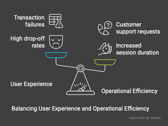
Since we didn’t have time for dedicated user testing on the legacy flow, I collaborated with our Analytics team to extract behavioral data and identify key friction points. By analyzing user behavior, we uncovered significant usability issues:
High drop-off rates on overdraft-related help pages indicated users struggled to find clear information.
Increased session duration on FAQ pages suggested users were searching extensively but still not finding what they needed.
Spikes in transaction failures correlated with the removal of overdraft protection, leading to frustration, increased churn, and additional customer support requests.
This combination of Google Analytics data and internal user research validated key friction points in the legacy flow. These insights allowed us to learn from past issues, refine the experience, and ensure the new design effectively addressed current user needs.
This combination of Google Analytics data and internal user research validated key friction points in the legacy flow. These insights allowed us to learn from past issues, refine the experience, and ensure the new design effectively addressed current user needs.
User Journey
To visualize the full user experience, I mapped out the customer journey using Miro, identifying areas where users encountered confusion and friction. This process helped my team and stakeholders see exactly where in the flow users were struggling, enabling us to focus our design efforts on solving critical pain points.
To visualize the full user experience, I mapped out the customer journey using Miro, identifying areas where users encountered confusion and friction. This process helped my team and stakeholders see exactly where in the flow users were struggling, enabling us to focus our design efforts on solving critical pain points.

CHAPTER 2
CREATE
Research revealed that users needed clarity, control, and confidence in managing their finances, yet the previous system lacked visibility and ease of use. My goal was to address these pain points by simplifying the process, reducing confusion, and ensuring users felt in control of their financial choices.
To achieve this, I designed a guided enrollment flow with real-time eligibility checks and upfront fee explanations, making it easier for users to understand their options. I also integrated self-service tools, an interactive FAQ, and proactive messaging to minimize the need for customer support and enhance the overall experience. Additionally, I introduced greater flexibility, allowing users to enable or disable overdraft protection at any time, reinforcing trust and user autonomy.
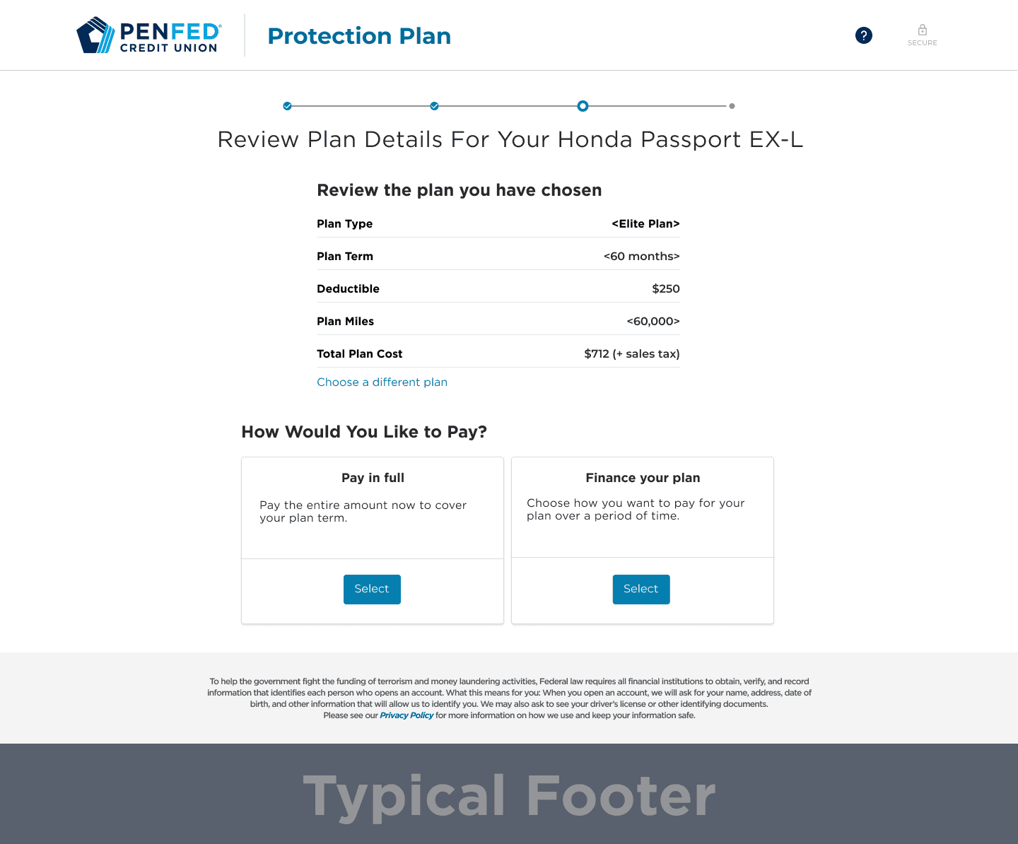
Landing Page
The landing page provides users with an overview of their current overdraft selection while allowing them to make adjustments. Users can choose between a Savings account or Line of Credit for overdraft protection. An expandable details section offers transparency, clearly outlining fees based on the selected account type to reduce unexpected charges.
The landing page provides users with an overview of their current overdraft selection while allowing them to make adjustments. Users can choose between a Savings account or Line of Credit for overdraft protection. An expandable details section offers transparency, clearly outlining fees based on the selected account type to reduce unexpected charges.


T&C Page
The original Terms & Conditions page lacked usability, forcing users to view all content at once. To enhance readability, we introduced a scrolling feature, requiring users to review the content before agreeing. This approach aligns with industry standards, ensuring compliance while maintaining an intuitive experience that smoothly transitions users to the confirmation step.
The original Terms & Conditions page lacked usability, forcing users to view all content at once. To enhance readability, we introduced a scrolling feature, requiring users to review the content before agreeing. This approach aligns with industry standards, ensuring compliance while maintaining an intuitive experience that smoothly transitions users to the confirmation step.


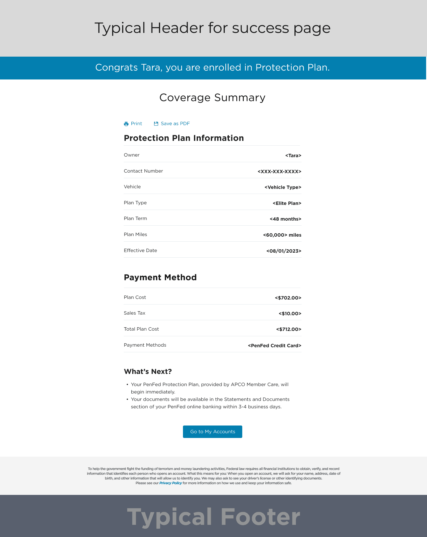
Confirmation Page
The confirmation page provides a clear summary of the user’s overdraft protection selection. A green notification box confirms the changes, reducing uncertainty and reinforcing transparency. This step eliminates confusion by ensuring users see their opt-in status, addressing a major usability concern identified in research, and minimizing unnecessary customer service inquiries.
The confirmation page provides a clear summary of the user’s overdraft protection selection. A green notification box confirms the changes, reducing uncertainty and reinforcing transparency. This step eliminates confusion by ensuring users see their opt-in status, addressing a major usability concern identified in research, and minimizing unnecessary customer service inquiries.
Current Selection Page
Users now have greater visibility into their existing overdraft protection settings. If already enrolled, they can review their selection in a structured layout, reducing uncertainty and frustration. Previously, users struggled to locate this information, leading to confusion. This improvement empowers users with control over their financial decisions while reducing unnecessary support interactions.
This structured approach ensures a logical, intuitive flow, guiding
users from discovery to enrollment while addressing key friction points uncovered in research.


CHAPTER 3
OPTIMIZE
OPTIMIZE
Reintroducing overdraft protection wasn’t just about restoring a feature—it was about creating a transparent, user-friendly experience that empowered users to manage their finances with confidence. Research showed users needed clarity, control, and flexibility, yet the previous system lacked visibility and ease of use.
To address this, I designed a four-step opt-in flow accessible from the Account Details page, making enrollment more intuitive. Collaborating with UX writers, I refined the language to align with PenFed’s branding, ensuring clarity and consistency. Additionally, I integrated proactive messaging to reduce customer support inquiries and introduced flexible controls, allowing users to enable or disable overdraft protection anytime.
This approach streamlined the experience, eliminated confusion, and rebuilt trust in the system.
Usability Testing Results
To ensure the redesigned overdraft protection experience was intuitive and effective, I conducted usability testing with Maze. The focus was to evaluate ease of setup, user understanding of overdraft protection, and friction points in the opt-in flow. By gathering direct user feedback, we identified key areas for refinement before launch.
To ensure the redesigned overdraft protection experience was intuitive and effective, I conducted usability testing with Maze. The focus was to evaluate ease of setup, user understanding of overdraft protection, and friction points in the opt-in flow. By gathering direct user feedback, we identified key areas for refinement before launch.
80% of users completed enrollment without assistance, confirming the process was generally intuitive.
Some users struggled with fee-related wording, leading us to simplify language for better clarity.
5 out of 20 users hesitated at the confirmation step, highlighting the need for clearer messaging.
Users wanted upfront information about eligibility, prompting us to introduce a pre-check feature before opt-in.

Business and user IMPACT
Breaking down the success metrics into direct impact and indirect impact provides a clearer picture of how the design changes influenced both immediate user behaviors and long-term business outcomes. Direct impact measures immediate improvements in user experience and financial performance, while indirect impact reflects broader operational and retention benefits that support long-term growth.
Breaking down the success metrics into direct impact and indirect impact provides a clearer picture of how the design changes influenced both immediate user behaviors and long-term business outcomes. Direct impact measures immediate improvements in user experience and financial performance, while indirect impact reflects broader operational and retention benefits that support long-term growth.
Direct Impact
Direct Impact
30% decrease in overdraft-related complaints, significantly reducing customer frustration.
7% reduction in account abandonment rate, leading to improved customer retention.
3% increase in deposit revenue, indicating greater user confidence in financial stability.
30% decrease in overdraft-related complaints, significantly reducing customer frustration.
7% reduction in account abandonment rate, leading to improved customer retention.
3% increase in deposit revenue, indicating greater user confidence in financial stability.
Indirect Impact
Indirect Impact
7% decrease in customer service inquiries, lowering operational costs and support burden.
5% plus increase in account retention, strengthening long-term customer loyalty and engagement.
7% decrease in customer service inquiries, lowering operational costs and support burden.
5% plus increase in account retention, strengthening long-term customer loyalty and engagement.
Reflection and Learning
This project reinforced the importance of proactive communication, transparency, and usability testing in financial products. One of the biggest takeaways was the need to prioritize user education and real-time feedback to eliminate uncertainty. Implementing pre-check eligibility, inline tooltips, and step-by-step guidance proved highly effective in reducing friction and confusion.
One major challenge I overcame was balancing time limitations, design constraints, and collaborative cross-functional team priorities. Advocating for users is rewarding but challenging at times. This experience helped me learn the importance of understanding each stakeholder's priorities, their success metrics, and goals to find alignment and win as a team.
Another key learning was the impact of cross-functional collaboration. By working closely with engineering, customer service, and analytics teams, we were able to align business needs with user priorities, ensuring a solution that was both technically feasible and user-centric.
Going forward, I’ll continue leveraging data-driven decision-making, rapid prototyping, and iterative testing to optimize financial experiences, ensuring that users feel empowered and confident in managing their money.

Hello!
Thanks for sticking around! If you’re curious to know more about me or want to see what I’m up to use the link on the right to connect with me!
Or, if you’re into the classic approach, feel free to check out my fancy paper resume.

@2025 jin, All Rights Reserved
Hello!
Thanks for sticking around! If you’re curious to know more about me or want to see what I’m up to use the link on the right to connect with me!
Or, if you’re into the classic approach, feel free to check out my fancy paper resume.
@2025 jin, All Rights Reserved
Hello!
Thanks for sticking around! If you’re curious to know more about me or want to see what I’m up to use the link on the right to connect with me!
Or, if you’re into the classic approach, feel free to check out my fancy paper resume.
@2025 jin, All Rights Reserved