
Revamp design system
Transformation Legacy Design System
Transformation Legacy Design System
When I joined PenFed, I faced an exciting challenge: there was no established design system in place. The existing design had grown outdated, leaving us with a unique situation, we needed to rebuild while keeping everything running smoothly. It was like renovating a house while living in it. We tackled two major tasks at once: restructuring the old system and transforming it into something entirely new. This dual approach allowed us to maintain current operations while paving the way for a modern, cohesive design future.
When I joined PenFed, I faced an exciting challenge: there was no established design system in place. The existing design had grown outdated, leaving us with a unique situation, we needed to rebuild while keeping everything running smoothly. It was like renovating a house while living in it. We tackled two major tasks at once: restructuring the old system and transforming it into something entirely new. This dual approach allowed us to maintain current operations while paving the way for a modern, cohesive design future.
80% Few UI A
70% Few UX Bugs
25% Increased development efficiency
100% Accessbility Compliance

My Role
My Role
I contributed as a designer on this transformative design system initiative while leading my own line of business within the Deposit and Auto Loan team. This project was a UX team effort, led by our UX Director and UX Strategist. My key contributions included:
Component Design: Developed foundational UI components that aligned with the new system
Accessibility: Ensured compliance with WCAG standards to improve usability
Collaboration & Documentation: Worked closely with designers and developers to document reusable patterns.
User Testing Support:: Assisted in evaluating iterations to enhance user experience.
My Responsbility
I contributed as a designer on this transformative design system initiative while leading my own line of business within the Deposit and Auto Loan team. This project was a UX team effort, led by our UX Director and UX Strategist. My key contributions included:
Component Design: Developed foundational UI components that aligned with the new system
Accessibility: Ensured compliance with WCAG standards to improve usability
Collaboration & Documentation: Worked closely with designers and developers to document reusable patterns.
User Testing Support:: Assisted in evaluating iterations to enhance user experience.
CHAPTER 1
Envision
When I joined PenFed, I faced an exciting challenge: there was no established design system in place. The existing design had grown outdated, leaving us with a unique situation—we needed to rebuild while keeping everything running smoothly. It was like renovating a house while living in it. We tackled two major tasks at once: restructuring the old system and transforming it into something entirely new. This dual approach allowed us to maintain current operations while paving the way for a modern, cohesive design future.
When I joined PenFed, I faced an exciting challenge: there was no established design system in place. The existing design had grown outdated, leaving us with a unique situation—we needed to rebuild while keeping everything running smoothly. It was like renovating a house while living in it. We tackled two major tasks at once: restructuring the old system and transforming it into something entirely new. This dual approach allowed us to maintain current operations while paving the way for a modern, cohesive design future.
Auditing the Legacy Design System
Auditing the Legacy Design System
Before diving into the redesign, I needed to understand the strengths and weaknesses of the existing system. Since the entire interface was built using Salesforce components, our redesign had to work within those constraints while improving the overall UX. I began by mapping out the entire legacy flow and categorizing existing design patterns to establish
a clear baseline.
Before diving into the redesign, I needed to understand the strengths and weaknesses of the existing system. Since the entire interface was built using Salesforce components, our redesign had to work within those constraints while improving the overall UX. I began by mapping out the entire legacy flow and categorizing existing design patterns to establish a clear baseline.
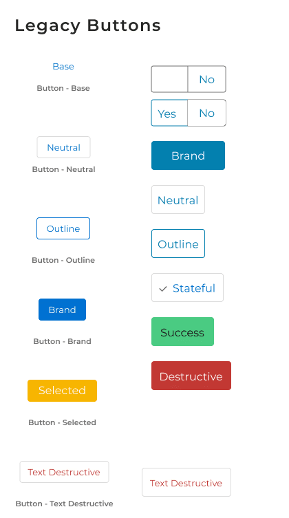
Button
Color
Toast
Select Payment Option
Financing Option
Review Page

Button
Color
Toast
Strengths & Gaps
What Worked?
Some components, like the Header and Footer structures and Spacing rules, had been successfully used across projects. These elements provided a reliable foundation that could be optimized rather than replaced.
What Worked?
Some components, like the Header and Footer structures and Spacing rules, had been successfully used across projects. These elements provided a reliable foundation that could be optimized rather than replaced.
What needed improvement?
Other elements, such as Tool Tips, Progress Bars, and Toast Messages, lacked consistency and failed to meet accessibility standards. These gaps introduced usability issues and inefficiencies in development, making them a priority for refinement.
Through this process, I uncovered gaps in consistency, accessibility, and usability that hindered efficiency. It became evident that a structured system was necessary to reduce design debt, improve collaboration, and enhance scalability for future projects.
To do this, I categorized the existing design system into key areas.To deliver immediate value while laying the groundwork for the full transformation, I focused on identifying what worked and what needed to change.a clear baseline.
To do this, I categorized the existing design system into key areas.To deliver immediate value while laying the groundwork for the full transformation, I focused on identifying what worked and what needed to change.a clear baseline.
Before diving into the redesign, I needed to understand the strengths and weaknesses of the existing system. Since the entire interface was built using Salesforce components, our redesign had to work within those constraints while improving the overall UX. I began by mapping out the entire legacy flow and categorizing existing design patterns to establish a clear baseline.
CHAPTER 2
CREATE
With the quick wins in place, the next logical step was leveraging Design System 1.0 as a foundation for building Design System 2.0. While the legacy system had clear limitations, it also contained valuable insights into what worked and what didn’t. Rather than discarding it entirely, I used it as a benchmark to guide and inform the new system’s structure.
With the quick wins in place, the next logical step was leveraging Design System 1.0 as a foundation for building Design System 2.0. While the legacy system had clear limitations, it also contained valuable insights into what worked and what didn’t. Rather than discarding it entirely, I used it as a benchmark to guide and inform the new system’s structure.
Page Standards and Base Components
I created new design patterns and standards to ensure consistency across flows and screens. By providing reference points for UX and development teams, we streamlined implementation and maintained cohesion.
By deconstructing ongoing redesign projects, I cataloged reusable base components, addressing gaps in the previous library and promoting design efficiency.Suck as color, spacing and icons.
Page Standards
Color
Info Box

Select Payment Option
Financing Option
Review Page
Functional Components
I developed key functional components, such as account summary cards and transaction tables, to reduce technical debt and enhance reusability.
I developed key functional components, such as account summary cards and transaction tables, to reduce technical debt and enhance reusability.
Button
Dropdowns
Toast

Select Payment Option
Financing Option
Review Page
Accessibility Enhancements
Accessibility Enhancements
Given PenFeds primarily retired veteran member base, I prioritized inclusive design by
Given PenFeds primarily retired veteran member base, I prioritized inclusive design by
Improving color contrast.
Integrating tools for assistive technologies
Ensuring WCAG compliance
Contrast
Colors

Select Payment Option
Financing Option
Review Page
Reflection and Learning
Key Learnings
Next Step
Iterative Implementation: The dual-track approach of implementing quick fixes while building a comprehensive system proved effective in maintaining operational continuity.
Cross-functional Collaboration: Strong partnerships between design, development, and business teams were crucial for successful adoption.
User-Centered Focus: Keeping our retired veteran member base at the forefront of decisions ensured meaningful improvements.
Reflecting on this design system transformation journey has been enlightening. While we successfully modernized PenFed's digital interface and improved user experience, the process revealed valuable insights about system-wide change management and the importance of balancing immediate needs with long-term vision.

Hello!
Thanks for sticking around! If you’re curious to know more about me or want to see what I’m up to use the link on the right to connect with me!
Or, if you’re into the classic approach, feel free to check out my fancy paper resume.

@2025 jin, All Rights Reserved
Hello!
Thanks for sticking around! If you’re curious to know more about me or want to see what I’m up to use the link on the right to connect with me!
Or, if you’re into the classic approach, feel free to check out my fancy paper resume.
@2025 jin, All Rights Reserved
Hello!
Thanks for sticking around! If you’re curious to know more about me or want to see what I’m up to use the link on the right to connect with me!
Or, if you’re into the classic approach, feel free to check out my fancy paper resume.
@2025 jin, All Rights Reserved